Choosing a Font
Taking into consideration everything I have found out about Eva from speaking to her I began to look through Adobe Font Folio and picking out typefaces which I thought appropriate by taking into consideration:
- Serif
- Calligraphic
- Black
- Elegant
- Natural
- Calm
- Friendly
- Traditional
- Neat
- Decorative

After speaking to Eva we decided that the most appropriate font for her would be Cochin Bold as it has the qualities of traditional typefaces, it is bold and black relating to the black letter calligraphy. Its not as harsh or intense as some of the other typefaces due to the rounded letters and elegant adjustments in line weight especially in lower case letters.


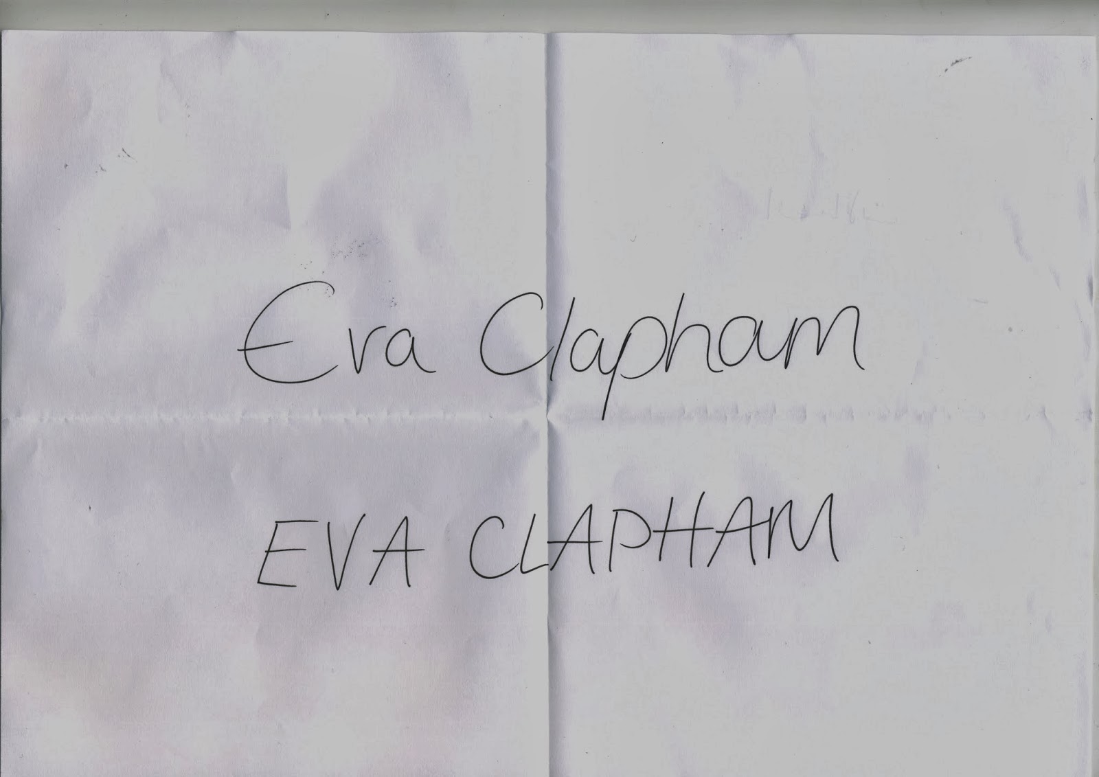
Here are a few examples of manipulating the existing typeface using a marker pen and tracing over the letters. I started by using Eva's name as part of the brief is to create a name badge and I wasted to first see how the letters could work together.

I would like to incorporate Eva's handwriting into the typeface to make it more natural and also as calligraphic lettering and script fonts are her favourite. I have experimented with adjusting the letterforms to suit this concept.
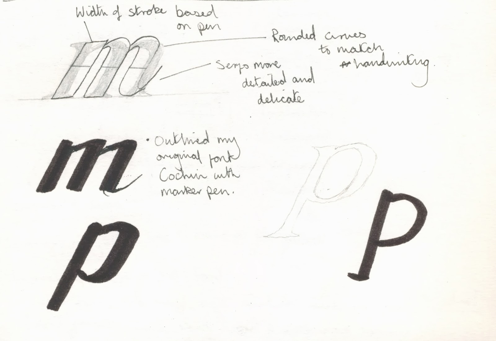
I have thickened the line weight on the stems and ascenders/descender of the letters and removed serifs to match the handwriting while trying to keep the overall structure of the original typeface the same. I also included a thin serif on the end of the letter to represent delicate and decorative, and so I could connect two letters together.

Crit
Sergey Shapiro
I found this project on Typography Served which shows how he has used sketches and hand written lettering to create this type. I think this specific project of his relates to what I want to end up achieving as the individual letters work in conjunction with one another resulting in a smooth calm typeface.

Additional Inspirational Fonts


Manipulation of Type
I began to trace over the font I had picked (Cochin Bold Italic) making adjustments which I thought would be appropriate. I focussed on rounding the typeface, leaving the just the ascenders and descenders with a flat edge. I chose to make these changes because I wanted to still retain an aspect of the blackletter type through the even line of the marker pen but also make it softer and smoother to match Eva's personality and handwriting.
Original Typeface (Cochin Bold Italic)


Above are some initial ideas of what I want the typeface to look like. I traced over the font above an made some adjustments. I have shown these letters as they are what I am going to base the other letters on, using the same width in the counters and making sure the shoulders and terminals are the same on each letter form so the typeface is consistent and works as a set.


Finished type after manipulations which I filled in black. I changed the line weight to be consistent in the letters F, G, J and Y. For the glyphs I took parts of other letters to maintain consistency, for example the exclamation mark uses the dot from the I (which I have also used as full stops and commas) and extended it.
No comments:
Post a Comment