

Florian Nicolle
I especially like these two portraits because of the use of the white space around the thin detailed pen lines and how there isn't an end point to the drawing. I also like how colour has only been used in the shaded areas and doesn't distract from the illustration but adds another layer.
Website: http://www.behance.net/neo_innov
Website: http://www.behance.net/neo_innov

This pictures use of symmetry is something that appeals to me and the vanishing point adds and intriguing depth to the image. I also like the moody tone he has created through his use of lighting and editing and has managed to capture a normal scene of the new york subway which millions of people would see everyday and turn it into something different.
Website: http://chrisozer.com/

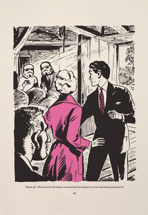
Imeus
Last year I went to a screen printing exhibition called Pick Me Up where I first saw Antony Peters' (Imeus) work. He combines illustrations with his own prints to take images out of context and give them a new meaning.
Website http://www.imeusdesign.co.uk/
Nico Bolacha (Neekoe)
Motion graphics is an area that I am not very familiar with and am constantly inspired by it. It takes elements of graphic design a step further through moving image and would be interested in learning more about it.
http://vimeo.com/29096514


Midnight Marauder
Freelance designer based in Los Angeles Midnight Marauder re-imagines movie poster designs into his distinctive gritty style. I prefer almost all of his alternative designs to the original because of his use of type, images and layout effectively set the tone for the films.
Website: http://www.midnight-marauder.com/
No comments:
Post a Comment