Produce designs for a set of three high impact posters that deliver a personal identified message derived from your research into part one of this brief.
The three posters should work as a set or series and be visually consistent. The first must be produced solely using type, the second solely with image and the third a combination of both type and image.
Background / Considerations
Focus on what you are trying to say and avoid generalisations and vague messages.
Keep it simple and to the point.
Are you making a statement, delivering facts or posing a question?
You should consider and investigate a broad range of possible visual solutions before making your design decisions.
Tone of Voice.
Memorable, immediate high impact and clear.
Challenging, potentially controversial but appropriate and not offensive.
Factual, statistical, informed and specific.
Proposal
The 'St Jude storm' was widely reported in the British press on 25 October, with comparisons being made to the Great Storm of 1987 and the Burns' Day Storm of 1990. A Met Office spokeswoman said the 1990 storm, when damaging winds affected a larger area of the UK, was a better comparison than the 1987 storm.
This information shows how exaggerated the early reports had been and how eager newspapers were to make a story out of something that ended up being fairly mundane for all but a few instances.
For this project I intend to create comparative posters between the 2013 St Jude storm and the Great Storm of 1987 in the form of an information graphic based on the statistics gathered to highlight how the recent storm failed to live up to its 'cataclysmic billing'.
I intend to use blind speculation from early reports from the newspapers, video reports and web articles I have researched and combine them with statistics and solid information gathered after the storm to show a contrast between the two storms and how the storm had been blown out of proportion.
Reports from 22nd October


I started to pick out some possible headings and text to use in my poster designs taken from the articles I have researched emphasising on dramatic words and quotes and some of my own words which could be appropriate.
"Devastating, Volatile, Chaotic"
"Hurtling across the Atlantic, the worst storm since 1987"
"Apocalyptic weather to batter UK"
"Bad storms? You've seen nothing yet..."
"Blown out of proportion"
"70? 80? 90? MPH?"
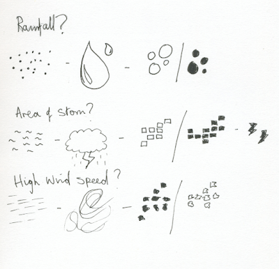
Infographic research Possible Icons for an Infographic
Quick ideas based on 2D images and icons that could work as a set to establish a theme for the posters.


The majority of feedback was on how the fact that it was a storm should be made clearer and that it should involve colour. The scanned images didn't connote wind or disruption but more digital error and corruption so I will have to find a different way of communicating it.
Colour
As the majority of my headlines have been sourced from red top newspapers and in response to the crit feed back I want to include the colours in my design. This would work well as we are limited to 2 colours plus stock.


Reports from 22nd October


"Devastating, Volatile, Chaotic"
"Hurtling across the Atlantic, the worst storm since 1987"
"Apocalyptic weather to batter UK"
"Bad storms? You've seen nothing yet..."
"Blown out of proportion"
"70? 80? 90? MPH?"
Infographic research Possible Icons for an Infographic
Quick ideas based on 2D images and icons that could work as a set to establish a theme for the posters.

I wanted to have icons that would work in a grid so I could easily measure them and be more specific in the placement, below are the ones I have chosen based on this idea.

Here are the finalised digital renders of the icons.


By showing these statistics I want the audience to have their own opinion on the storm. It depends on where you were as some areas were his really bad and people would have had a totally different experience, where as others would have hardly noticed which is why I have decided to map out the storm.
Type & Image


Type
For my only type poster I wanted to use a tagline or subheading which relates to the reports of the storm. As I have showing statistics and leaving people to decide I wanted to ask the question: 'Blown out of proportion?' this suggests that news papers could have dramatised the nature of the storm in early reports but the questioning leaves it up to the individual to decide.
Experiments below on how I can visually communicate this question using the physical elements of the storm as my basis.


Interim Crit

The majority of feedback was on how the fact that it was a storm should be made clearer and that it should involve colour. The scanned images didn't connote wind or disruption but more digital error and corruption so I will have to find a different way of communicating it.
Colour
As the majority of my headlines have been sourced from red top newspapers and in response to the crit feed back I want to include the colours in my design. This would work well as we are limited to 2 colours plus stock.


The choice of type was informed by the banners of the red top papers, it needed to be a bold sans-serif typeface in this case I have used helvetica bold and gotham. The distorted type, instead of being warped on the scanner has been displaced over an image from the storm the emphasise some of the chaos it caused. I have asked the question at the end as it would lead onto the other posters where the statistics have been displayed.
Final Set of Posters
Added a key as it was found to be slightly unclear during the presentation.


No comments:
Post a Comment