Labels

Thursday 21 November 2013

OUGD405 - Studio Brief 1 - Frame (Photoshop)

   Brief 

Re-imagine the backing paper for a photo frame. This must include the dimensions of the frame. You must produce a minimum of three designs, which work as a set across three different frame sizes. Choose from the frame dimensions below: 

6x4 inches - 7x5 inches - 8x6 inches 

A5 - A4 - A3 

Be creative with your manipulations and compositions. Consider how to engage a buyer and what needs to be communicated. 

Background / ConsiderationsExplore a range of concepts in your research and development of your own ideas. Consider the usage, functionality and display within commercial outlets when resolving this problem. 

Not all your investigations should take place on the Mac. Digital image capture methods such as scanning and digital photography allow you to import media from a range of sources (photographs, photocopies, drawings, tracings, found material etc.)
Once you have imported this material how can you manipulate using the tools and capabilities of Photoshop (cropping, selecting, layering, repeating, colour changes, reversing out etc.)


All typography and vector based images must be produced in Adobe Illustrator. Any images must be manipulated in Adobe Photoshop. The final composition must be produced in Adobe Photoshop.

I went out and photographed photo frames with stock images to see the type of images that are being used. Many of them feature generic photos which match the frame its in. For example, a white frame would typically have a black and white photo to match and the typeface would fit the frame/brand.   


The frame above uses a typical photograph which matches the frame its self. The frame is minimal and sophisticated and the age of the people in the photo could suggest its target audience. The white could suggest wedding photos and the gray scale image could show maturity.
The serif and script types used also relates to this as it is often found on wedding invitations.   


Clas Ohlson sell simple thick frames which match their brands bold sans-serif logo. These frames were all either black or white and like the one above had a black and white image as the backing photo. The photo used can encompass a large audience although it is fairly generic and uninteresting. The fonts used however match the brand and work well with the frame.  


Some of the most common backing photography were holiday pictures. These in particular are trying to represent a high quality image/lifestyle using 'alternative' images of Paris. The colours have also been slightly adjusted to resemble analogue photography.      


Type only template which makes use of the space and links the font with the frame as it is a chunky serif that matches the thick frame. The brand as been clearly included as well as the dimensions. 


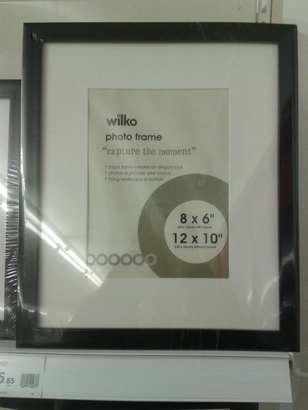
Again this is a simple non decorative frame and the content of the image reflects this. There may be too much information but the key info has been communicated clearly through the use of a large bold font. The use of a tag line gives all the frames a theme which works with the brand and makes it more friendly. The colours aren't really that interesting or eye catching and the circle isn't really necessary as it unbalances the composition.     


Friday 15 November 2013

OUGD403 Evaluation

During this module I have gained a lot of new skills through the variation of the briefs and design workshops. A large proportion of this module was typography based which is an area of graphic design I have a great interest in and found the things I learnt in our sessions with Fred to be incredibly beneficial. These sessions strongly informed my practise and  through the decisions I made in the briefs running alongside them.  

We worked on producing two typefaces for two of the five briefs we were set and were encouraged to work both by hand and digitally through programs such as Illustrator. Producing hand rendered work, especially for typefaces, was a useful approach in terms of developing concepts and a range of experiments. I really enjoyed brief 1 where this was put into practise then combined with Illustrator to form brief 2. The most challenging part of this module for me was the delivery of brief 5 where we were tasked in creating 3 posters relating to a news story. I hadn't previously had a project which had significant restrictions in terms of format, colours and content of the posters and I was difficult to produce a piece especially for the image only poster which voiced an opinion. If I could revisit brief 5 I would have liked to explore a few other ways of communicating my topic as I was drawn to one idea from early on. It was interesting to see what other students were producing and their own interpretations through critiques and presentations where constructive feedback was given.


Monday 11 November 2013

OUGD401 - Study Task 5

blake font detail overview

FS Blake is a sans-serif typeface designed by Emanuela Conidi in 2010 for Fontsmith type foundry. I have recently discovered Fontsmith and signed up to their mailing list where I received a leaflet showcasing this typeface. The typeface FS Blake is a mix of different shapes making it multi purpose, it can be used assertively and forcefully through the heavier weights while the lighter weights are more elegant. The versatility of the fonts is what I like about it as it doesn't necessarily have fixed connotations which would make it work well as type for editorial design such as a magazine or newspaper which often requires a typeface to communicate in a large amount of voices.     

Wednesday 6 November 2013

OUGD403 - Studio Brief 2 - Illustrator Typeface

Creating a Typeface on Illustrator

Having not used Illustrator before I found the workshops extremely useful. I quickly found a way to generate the desired effect on my type using the a series of lines mapped over a letter and using the warp tool I was able to accurately adjust the curves to fit with in the letters. 


Here I have shown what the letters look like after removing the stroke. I spoke to a couple of people on what they thought of the type face as I thought it was working however the legibility was becoming an issue and the format was difficult because of the individual lines around the letters. The feedback I got was primarily the same and the type as a whole lost consistency due to the lines being too distorted in areas compared to others. 


In response to this I started to create the second idea I had which was also recommended in the crit. Here I have shown how I have created cut in the letters, drawing a shape around the section of the letter I wanted to remove and using 'Minus Front' option in the Pathfinder window. 


Monday 4 November 2013

OUGD403 - Brief 5 - Message & Delivery: Delivery

Brief

Produce designs for a set of three high impact posters that deliver a personal identified message derived from your research into part one of this brief.

The three posters should work as a set or series and be visually consistent. The first must be produced solely using type, the second solely with image and the third a combination of both type and image.
Background / Considerations

Focus on what you are trying to say and avoid generalisations and vague messages.

Keep it simple and to the point.

Are you making a statement, delivering facts or posing a question?

You should consider and investigate a broad range of possible visual solutions before making your design decisions.

Tone of Voice.

Memorable, immediate high impact and clear.

Challenging, potentially controversial but appropriate and not offensive.

Factual, statistical, informed and specific.


Proposal 


The 'St Jude storm' was widely reported in the British press on 25 October, with comparisons being made to the Great Storm of 1987 and the Burns' Day Storm of 1990. A Met Office spokeswoman said the 1990 storm, when damaging winds affected a larger area of the UK, was a better comparison than the 1987 storm. 


As more information was reported in by the Met Office predictions of the storm were compared to have a severity more like storms in October 2000, January 2007, and March 2008. 

This information shows how exaggerated the early reports had been and how eager newspapers were to make a story out of something that ended up being fairly mundane for all but a few instances. 

For this project I intend to create comparative posters between the 2013 St Jude storm and the Great Storm of 1987 in the form of an information graphic based on the statistics gathered to highlight how the recent storm failed to live up to its 'cataclysmic billing'.

I intend to use blind speculation from early reports from the newspapers, video reports and web articles I have researched and combine them with statistics and solid information gathered after the storm to show a contrast between the two storms and how the storm had been blown out of proportion.    

Reports from 22nd October


I started to pick out some possible headings and text to use in my poster designs taken from the articles I have researched emphasising on dramatic words and quotes and some of my own words which could be appropriate. 

"Devastating, Volatile, Chaotic"  

"Hurtling across the Atlantic, the worst storm since 1987" 

"Apocalyptic weather to batter UK"

"Bad storms? You've seen nothing yet..."

"Blown out of proportion"

"70? 80? 90? MPH?"

Infographic research Possible Icons for an Infographic 

Quick ideas based on 2D images and icons that could work as a set to establish a theme for the posters. 


I wanted to have icons that would work in a grid so I could easily measure them and be more specific in the placement, below are the ones I have chosen based on this idea.  


Here are the finalised digital renders of the icons.


By showing these statistics I want the audience to have their own opinion on the storm. It depends on where you were as some areas were his really bad and people would have had a totally different experience, where as others would have hardly noticed which is why I have decided to map out the storm. 

Type & Image


Type

For my only type poster I wanted to use a tagline or subheading which relates to the reports of the storm. As I have showing statistics and leaving people to decide I wanted to ask the question: 'Blown out of proportion?' this suggests that news papers could have dramatised the nature of the storm in early reports but the questioning leaves it up to the individual to decide. 

Experiments below on how I can visually communicate this question using the physical elements of the storm as my basis. 


Interim Crit


The majority of feedback was on how the fact that it was a storm should be made clearer and that it should involve colour. The scanned images didn't connote wind or disruption but more digital error and corruption so I will have to find a different way of communicating it.     

Colour

As the majority of my headlines have been sourced from red top newspapers and in response to the crit feed back I want to include the colours in my design. This would work well as we are limited to 2 colours plus stock. 


The choice of type was informed by the banners of the red top papers, it needed to be a bold sans-serif typeface in this case I have used helvetica bold and gotham. The distorted type, instead of being warped on the scanner has been displaced over an image from the storm the emphasise some of the chaos it caused. I have asked the question at the end as it would lead onto the other posters where the statistics have been displayed.

Final Set of Posters

Added a key as it was found to be slightly unclear during the presentation.


Sunday 3 November 2013

OUGD401 (Study Task 4) Drive Movie Poster - Semiotic Analysis


Above is an alternative poster designed by Luis Fernando Cruz for the film Drive which was released in 2011 and was directed by Nicholas Winding Refn. One of the most prominent elements of this poster is the use of the colour pink which symbolises love and compassion. These are strong themes present in the film. The colour pink is a tone down from the physical passion signified by red and instead brings in purity, goodness and decency which symbolised by the addition of white.

The black silhouette of the male lead character connotes guilt, darkness, impurity, mystery and suggests that it is not necessarily him that is the hero of the film despite what the tag line might suggest. Mythic elements of the film are suggested furthermore by the contrast in colours used as the pink brushes that appear to be exploding out of the dark silhouette and it is the male character overcoming the darkness (good vs evil) suggesting a struggle within between compassion and immorality. This fits into western myths of male and female sexuality being significant opposites and based on male dominance.

The title ‘Drive’ indicates movement and change. The type for the word ‘Drive’ is in pink; the use of a script font signifies femininity and delicacy and indicates that the female character is the one who is driving change. Adding the masked figure, which may only be clear that it is him after watching the film, connotes multiple aspects of his life. The mask signifies a double life as it is put on when he is about to commit an immoral and dark act and symbolises the alternate side of his personality. The positioning of his hand to his mouth could signify doubt, regret, guilt and a conscience leading to issues of immorality and an internal struggle that tie into the said emotions and is not necessarily a physical conflict.

The poster has effectively managed to cover the key themes and codes in western society that are found in the film through appropriate use of type, colour, form and image. The end result being a high impact and aesthetically pleasing poster made to capture the attention of its audience.