- Resident Advisor
Zomby’s Let’s Jam record is a combination of a homage to Acid House and new sounding experimental grime. Track titles such as ‘Acid Surf’ ‘Peroxide’ and ‘Neon’ brought to mind very bright and bold images of type and colour on packaging for cosmetic products.
*click images to expand
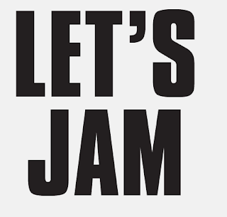
For both records I wanted to create custom typefaces. I chose loud bold typefaces that represented the music and edited them in a way I felt put it into an old 90s context which I feel you get from these type designs.
Experimenting with layout of type and image. Wanted you use tongue in cheek imagery to directly reference where Zomby's sound has been inspired from, which in this case was Acid House.
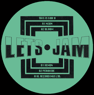
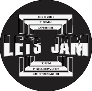
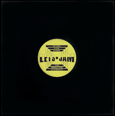
Record Sticker
I decided that a full outer sleeve for this record wasn't really working and it didn't feel like a dance record. I looked at a number of other record from the time and found that many of them just used a centre sticker as the single graphic element so decided to focus on this.
Another nod to the the acid house era was the use of a bright acid yellow which was a colour strongly associated with the scene due to the adopted smiley face mascot that was found all over flyers, posters and clothing for the raves.
Sleeve Sticker
To add another layer to the record cover I created a sticker to go on the sleeve combining the type used so far in the project. I wanted the type to become an image itself so combined the three typefaces and their different fonts to create something that was visually stimulating.
Inside Sleeve
I have added quotes from my essay that give reasons as to why certain aspects of culture often have revivals.
I thought the yellow was a bit overwhelming when printed out full size and asked for other opinions and if they thought the same. So tried a black and white or a softer dark green/blue which complimented the stickers bright yellow.


No comments:
Post a Comment