Context of Practice
Jake Simmonds
Thursday, 14 January 2016
Tuesday, 12 January 2016
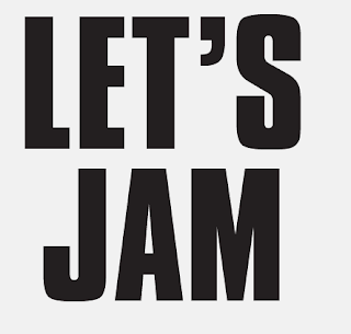
Zomby Vinyl Sticker + Type
‘Old-skool ghosts haunt the record; samples of former glories packing punches like bouts of Stockholm Syndrome on the senses as you glance familiar faces from well over a decade ago.’
- Resident Advisor
Zomby’s Let’s Jam record is a combination of a homage to Acid House and new sounding experimental grime. Track titles such as ‘Acid Surf’ ‘Peroxide’ and ‘Neon’ brought to mind very bright and bold images of type and colour on packaging for cosmetic products.
*click images to expand
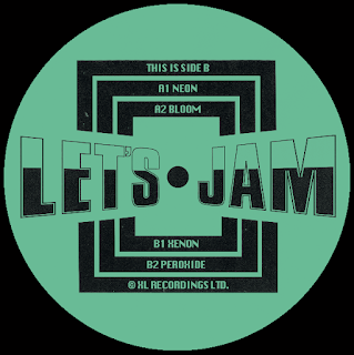
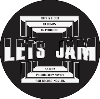
I wanted to convey energy and movment across the type as these were the sounds that would have been heard at raves in the 90s. To do this I experimented with the perspective of he type. I particualy like the ‘Let’s Jam’ perspective in the centre label as is pulls the viewer in and is enhnced even more when the record is spinning.
A reason I gave in my essay to the resurgence of visual and musical styles was because of the current political, social and economical climate mirrored the time when they first came about, in this case rave culture. I have used images of political riots in the 90s juxaposed alongside people attending raves with a care free attiduce as there means of tempoary escape from the promblems in society. The aesthetic harks back to old web interfaces and primative digital graphics prominent throughout the 90s.
- Resident Advisor
Zomby’s Let’s Jam record is a combination of a homage to Acid House and new sounding experimental grime. Track titles such as ‘Acid Surf’ ‘Peroxide’ and ‘Neon’ brought to mind very bright and bold images of type and colour on packaging for cosmetic products.
*click images to expand
For both records I wanted to create custom typefaces. I chose loud bold typefaces that represented the music and edited them in a way I felt put it into an old 90s context which I feel you get from these type designs.
Experimenting with layout of type and image. Wanted you use tongue in cheek imagery to directly reference where Zomby's sound has been inspired from, which in this case was Acid House.
Record Sticker
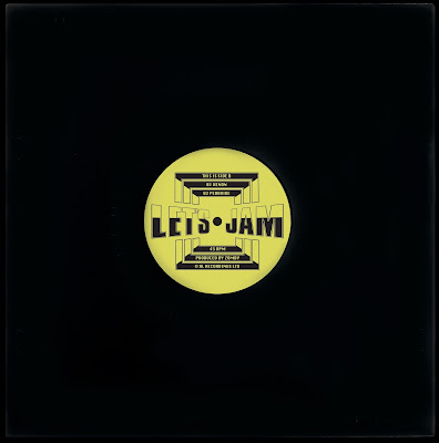
I decided that a full outer sleeve for this record wasn't really working and it didn't feel like a dance record. I looked at a number of other record from the time and found that many of them just used a centre sticker as the single graphic element so decided to focus on this.
Another nod to the the acid house era was the use of a bright acid yellow which was a colour strongly associated with the scene due to the adopted smiley face mascot that was found all over flyers, posters and clothing for the raves.
Sleeve Sticker
To add another layer to the record cover I created a sticker to go on the sleeve combining the type used so far in the project. I wanted the type to become an image itself so combined the three typefaces and their different fonts to create something that was visually stimulating.
Inside Sleeve
I have added quotes from my essay that give reasons as to why certain aspects of culture often have revivals.
I thought the yellow was a bit overwhelming when printed out full size and asked for other opinions and if they thought the same. So tried a black and white or a softer dark green/blue which complimented the stickers bright yellow.
Monday, 11 January 2016
Special Request: Type + Vinyl Design
The majority of the rave flyers and posters I looked at made use of bold loud typefaces that had been manipulated in some way. Special Request's music on this record is powerful and bass driven made appropriate for big event spaces such as warehouses. I wanted to reflect this in the type used so opted for an industrial display font called Timmons NY.
Made slight manipulations to the letters by sharpening up the corners and extending the cap height to make the type look more imposing.
The lettering has been given a bevelled effect to bring it off the 2D surface and make it pop out, this is type of skeuomorphism was fairly common on the posters and flyers from the early to mid 90s but have used it more subtly here to avoid and overly cliché aesthetic.
Initial mock-up of cover with label logos and records sub-title. Next stage is to experiment with type alongside other images and type for track names, creating a variety of possible compositions.
Taking imagery from 90s rave poster and flyer designs. The space/futurist themes were often used as they reflected the forward thinking music from the time and arguably the build up to the millennium. It also creates a sense of scale and atmosphere that is present within Special Requests music.
Gradient detail around the track names which links both front and back covers.
I decided to change from the idea of creating and entire album cover as the designs I came up with felt as though they weren't capturing what this kind of dance music was about. It is also common for dance records to concentrate more heavily on the centre labels on the record itself which will have a cut out circle on the sleeve so it can always be visible.
After looking at some examples I found some labels I have drawn inspiration from (see above post).
I wanted the typography to be a strong focus with this project and explored how I could represent a culture such as club music through the use of it alone.
For the extra information on the sticker I have combined two typefaces (Ariel and Letter) mixing up different weights and sizes to make the label. The bold attention-grabbing type communicates what the music is about and reflects the nature of it well.
Here is the finished casing with outer and centre stickers attached.
Portfolio Project
Subscribe to:
Comments (Atom)


